Friday, 18 May 2012
Wednesday, 16 May 2012
Friday, 11 May 2012
Friday, 4 May 2012
Thursday, 3 May 2012
Final Arkitekt Front Cover
This is what my final Arkitekt cover looks like.
Colour photographs of final pieces mounted on card coming up soon....
Arkitekt - Front Cover
The front cover is called Arkitekt and I have kept the title and the issue date the same style as the running head in both double-page spreads. I have also decided to use the same way of displaying some photographs as I have on the Carbuncles spread and feel it works well, combining park pictures and architecture buildings.
First attempt at the front cover
Still to be done:
- Background colour to be added
- Photograph layout to be edited
- Emphasis on the quote
Post-stick memos on what needs to be edited
Completed Hooray for Carbuncles
In this photograph the captions have been added, as well as the quote has been edited so that the quotation marks are singular objects so could be moved easily. I have also made Housden bold to match with the previous theme of quotations in the x5 articles. At this stage I was feeling pretty happy with how it was all coming together and finishing nicely. This final spread is to then be printed in colour and mounted professionally onto A2 card and placed within an A2 plastic sleeve.
Further Mac editing
After the layout of the text had been sorted I decided to see what it would look like with a solid rectangular photo in the gap between the introduction and the starting body copy. After the feedback session it was suggested that maybe the design for the photographs were several photos staggered in a line bleeding off the page. I decided to go with this suggestion as it is something I could have carried on with my front cover.
Testing out a rectangular image
(Taken from Google Images)
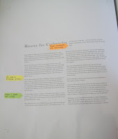
The orange post-stick note suggests
adding captions underneath and to the side
each of the featured photographs like I have
done on the x5 article spread
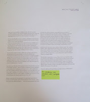
The post-stick note on this page suggests
getting rid of the Widows that remain on this
page to make it appear more professional
Progress on the Mac
The next stage was to emphasise the main quotation in the text. There are a lot of small quotes in the passage but with those I have decided to make them Italic and therefore place all the main attention on the main quote by Housden. Embedding the quote the way I have done meant wrapping the text around the main body copy. The space below the introduction is left for some imagery which had yet to be decided at that stage. The bottom photo shows three columns of main body copy with the highlighted feature text above it, also following the inter-character spacing style like the main title.
Featured quote before further editing
First attempts on the Mac
After completing some of my thumbnail designs and then feeling confident enough to start the spread on the computer I simply pasted the text into text boxes without editing the paragraph spaces or the type size/inter-character spacing. This was a case of purely seeing how all of the text fitted onto the page. The post-stick notes are there to help me remember what needs to be edited when I next went onto the computer.


Thumbnail Designs
The next stage was to create a range of thumbnails to generate ideas about what this second double-page spread. I found this double-page spread easier to design then the first due to the consistent flow of the text with there being now separate articles.
Range of thumbnails and quotation designs
Thumbnail 1
Thumbnail 2
Thumbnail 3
Quotation Designs
Carbuncle Spread first final design
Carbuncle Spread second final design
Taking the text apart
I followed the same process as I did in the x5 articles and read through all the text and underlined and made aware the parts that were of more importance e.g quotations.
Subscribe to:
Comments (Atom)


