Showing posts with label 4VC004 - Experimental Typography. Show all posts
Showing posts with label 4VC004 - Experimental Typography. Show all posts
Friday, 4 May 2012
Thursday, 3 May 2012
Final Arkitekt Front Cover
This is what my final Arkitekt cover looks like.
Colour photographs of final pieces mounted on card coming up soon....
Arkitekt - Front Cover
The front cover is called Arkitekt and I have kept the title and the issue date the same style as the running head in both double-page spreads. I have also decided to use the same way of displaying some photographs as I have on the Carbuncles spread and feel it works well, combining park pictures and architecture buildings.
First attempt at the front cover
Still to be done:
- Background colour to be added
- Photograph layout to be edited
- Emphasis on the quote
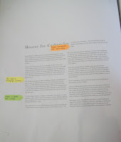
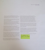
Post-stick memos on what needs to be edited
Completed Hooray for Carbuncles
In this photograph the captions have been added, as well as the quote has been edited so that the quotation marks are singular objects so could be moved easily. I have also made Housden bold to match with the previous theme of quotations in the x5 articles. At this stage I was feeling pretty happy with how it was all coming together and finishing nicely. This final spread is to then be printed in colour and mounted professionally onto A2 card and placed within an A2 plastic sleeve.
Further Mac editing
After the layout of the text had been sorted I decided to see what it would look like with a solid rectangular photo in the gap between the introduction and the starting body copy. After the feedback session it was suggested that maybe the design for the photographs were several photos staggered in a line bleeding off the page. I decided to go with this suggestion as it is something I could have carried on with my front cover.
Testing out a rectangular image
(Taken from Google Images)
The orange post-stick note suggests
adding captions underneath and to the side
each of the featured photographs like I have
done on the x5 article spread
The post-stick note on this page suggests
getting rid of the Widows that remain on this
page to make it appear more professional
Progress on the Mac
The next stage was to emphasise the main quotation in the text. There are a lot of small quotes in the passage but with those I have decided to make them Italic and therefore place all the main attention on the main quote by Housden. Embedding the quote the way I have done meant wrapping the text around the main body copy. The space below the introduction is left for some imagery which had yet to be decided at that stage. The bottom photo shows three columns of main body copy with the highlighted feature text above it, also following the inter-character spacing style like the main title.
Featured quote before further editing
First attempts on the Mac
After completing some of my thumbnail designs and then feeling confident enough to start the spread on the computer I simply pasted the text into text boxes without editing the paragraph spaces or the type size/inter-character spacing. This was a case of purely seeing how all of the text fitted onto the page. The post-stick notes are there to help me remember what needs to be edited when I next went onto the computer.


Thumbnail Designs
The next stage was to create a range of thumbnails to generate ideas about what this second double-page spread. I found this double-page spread easier to design then the first due to the consistent flow of the text with there being now separate articles.
Range of thumbnails and quotation designs
Thumbnail 1
Thumbnail 2
Thumbnail 3
Quotation Designs
Carbuncle Spread first final design
Carbuncle Spread second final design
Taking the text apart
I followed the same process as I did in the x5 articles and read through all the text and underlined and made aware the parts that were of more importance e.g quotations.
Hooray for Carbuncles text
Running head is Architecture Review
Title
Hooray for Carbuncles
Introductory text
The Tricorn Centre, the South Bank… No one has a kind word to say about
the Brutalist concrete experiments of postwar British architecture. Except,
that is, for Tom Joplin.
South Hill Park is a middle-class dream. It is quintessential Hampstead:
a leafy avenue with the heath on all sides. Its huge brick terraces are crammed
with North London media types keeping up appearances behind furiously twitching
Cath Kidston curtains. And the house prices are enough to make you wince.
Perfect. Well, not quite.
Number 78, to many locals, is the worm in the apple. No 78 is concrete.
Very concrete. In fact it almost revels in its very un-Hampstead concreteness,
with rough, muscular, bunkersized slabs that don't even nod good morning to the
neighbours, but glower at them. Its roofline, low and flat, cold-shoulders
their pitched roofs. It looks unfinished, awaiting its pretty facade. But this
is it—solid, brutish, without a care for the delicate sensibilities of
Hampstead. There's no other house like it in Britain. I love it.
Who put this abomination here? Brian and Margaret Housden, an awfully
genteel pair as it turns out, dressed in tweed and twin-set as if permanently
primed for afternoon tea. When Brian, fresh from architecture school, started
on No 78 40 years ago locals were aghast. "People kept coming to the front
door and peering in," he recalls, puffing benignly on his pipe. Housden's
inspiration was Aldo Van Eyck, a colleague of the Smithsons, who tried to build
intimate spaces that felt more rich than they looked.
"Van Eyck called it deliberate ambiguity," says Housden.
"He wanted an evocative architecture which aspired to poetry. That's what
I've tried here." He's decorated the house in symbols, quotes from
Heraclitus, and sheets of glass lenses, which fracture Hampstead Heath into a
collage.
Many still haven't got used to it. Think of the house prices! Quick
unscientific poll of passers-by: three against ("looks like a
prison"), one hurrying doctor for—"It's fun. Look at all these boring
ones up the street." As far as Brian and Margaret are concerned, they are
just exercising their Englishman's right. And if people don't like the, well,
castle-like look of their castle? "They can look the other way,"
chuckles Brian. He has a steely glint behind the pipe. "I don't think they
understand," adds Margaret. "I can see how some people wouldn't be
able to live with it. All these browns and greys are a bit dismal, admittedly.
But if you look close it glistens."
People have been upsetting the neighbours with eyesores for centuries.
Overcrowded Britain is spiritual home to the Nimby, tirelessly battling against
the modern, which, in whatever form` never quite fits in with some undefined,
somehow "authentic", green and pleasant British landscape and
culture. Britain has only just come to terms with white-walled modernism,
thanks to 40 years of Terence Conran.
But No 78 belongs to a breed of modernity that gets passions boiling
like no other: postwar concrete carbuncles.
Concrete is still beyond the pale. So much so that, 20 years after the
Prince of Wales's infamous "carbuncle" speech, it's the carbuncles
themselves, ironically, that are under threat, just like Victorian or Georgian
architecture 50 years ago. This year's highest profile victim was the Tricorn
Shopping Centre in Portsmouth, whose elephant hide turrets, once so a la mode,
didn't suit the city's shiny new image; it's being demolished for a glitzy
new-model shopping mall.
Birmingham wants to demolish its Central Library, a spirited upside-down
ziggurat that the Prince likened to an incinerator. The future of the Hayward
Gallery, says the chief executive, Michael Lynch, is far from secure in his
masterplan to polish up the South Bank. What to do with postwar architecture
still causes the most headaches at English Heritage, which first raised the
possibility of listing it in 1995. Concrete Brutalism is just beyond the
cutting edge of taste, not the kind of thing you'll see on Restoration. Many
find it hard to think fondly about architecture once the very enemy of
conservation.
It's easy to hate Brutalism. It seems to conform so effortlessly to that
hackneyed image of the ruined concrete jungle photographed in black and white,
windows smashed concrete stained and dripping.
It was a very convenient image for those in the late Seventies and
Eighties keen to "prove" the failure of the welfare state. Here were
the ruined monuments. Their ruination was often the fault of developers,
architects and planners, pushing technology and a material, which, despite
being used by the Romans, was still in its infancy in Britain. But then we did
need to repair a whole postwar country fast. More often, though. the failings
were due to money.
Most Brutalism, though, was built as public space, and when public
finances shrivelled up in the Seventies Brutalism was often left unfinished and
unmaintained. The Hayward, for instance, was meant to be draped in hanging
gardens, Pop Art neon and projections; instead, budget cuts slowly sealed off
its walkways and terraces, leaving it a Cold War bunker. Only recently, with
its walkways reopened, its concrete cleaned and a new entrance built by the
artist Dan Graham and architects Haworth Tompkins, has the Pop Art fun palace
its creators intended started to creep back.
Like all good art, Brutalism divides opinions because it demands effort
from you. Its avantgarde "inventors" wanted to build an architecture
that both challenged us and comforted us. It challenged us because it was
so—well—architectural. The chief apologist for Brutalism Rayner Banham, wrote
in the Fifties how, even then, people "complained of the deliberate
flouting of the traditional concepts of photographic beauty, of a cult of
ugliness". Brutalism was "anti-art, or at any rate anti-beauty in the
classical aesthetic sense of the word".
Britain, in particular, has long promoted a very picturesque
appreciation of architecture. But Brutalism replaced Thomas Aquinas's idea of
beauty—quad visum placet (that which seen pleases) — with quod visum perturbat
(that which seen, affects the emotions). Brutalism is gutsy stuff. You have to
get inside it to appreciate its sculptural forms, its tactile surfaces. This is
architecture to explore like sculpture, to let yourself go in. Not something
the British are awfully good at.
Most postwar avant-garde artists and architects were seeking a common
form to express and salve their existential angst. Not the easy nostalgia of
the past, nor the Utopian machine age rationalism of Mies van der Rohe and
Corbusier, but something modern and traditional, collective and personal, a
physical version of John Osborne and Lindsay Anderson's anti-intellectualising
plays and films, something speaking the language of the street. Banham called
them "new brutalists" not because they intended us misery, but in
homage to Jean Dubuffet's art brut.
Rawness was all. The architects Alison and Peter Smithson called it
"the warehouse aesthetic", whose exposed structure and honesty would
communicate more directly with us. It was a modern version of Arts and Crafts.
Some saw this new vernacular in the "primitive" adobe towns of North
Africa; the Tricorn was called "casbah" architecture. Others looked
to barns or caves. Denys Lasdun created the National Theatre as an English
hillside.
The artist Dan Graham likens it to punk. Without this form of
expression, where the experience of the building is more important than its
looks, we'd have no Frank Gehry, no Daniel Libeskind, no Zaha Hadid. Brutalism
never went away; it just got better looking and learnt to sell itself. In
Waterloo, a bunch of neo-Brutalist apartments, concrete raw-and hard, by the
fashionable architects De Rijke Narsh Morgan sell for £750,000, packaged as the
height of urban gritty cool. In South Hill Park, No 78's no eyesore. It's a
gold mine.
Highlighted text
Concrete is still beyond the pale 20 plus years after the Prince of
Wales Speech
Making one article more prominent than the rest
One of the main aims in the first double-page spread was to make one article more prominent and eye-catching than all the rest. I decided to make the Georgian Architecture the more prominent article by making the introduction bold and a little larger as well as take up more room by using columns to present the 4 sub-heading topics.


Wednesday, 2 May 2012
Adding Photos and Colour
This brief allowed colour to be used within both the two double-page spreads and the front cover. I have only decided to use colour when it comes to the quotes. I haven't decided to plaster the page with photos as I am quite a fan of using white space in my work and don't like the feeling of something being too overcrowded. The first photo above Georgian Architecture may not relate to Architecture itself but I have chosen to use it due to the Macro effect given and the detail of type on the sign itself.
Composition
Once the alignments had all be sorted and death with it was now time to sort out of the composition element of the text. After I was happy with how it looked I printed it out onto A3 and then cut it out and placed onto a sheet of layout paper to see what the page size with the text on would look visually correct. I added post-stick notes to help me easily see what needed to be edited when I was next on the Mac.


Alignments
After I had started to work on the computer I decided to print out a first rough draft and see where the alignments of each article where pitching up on the page. I found this a good way to help re-arrange and point out places within the design that could be improved.
After this stage the page size went from being 245mm in width and 299mm in height to being 250mm in width with the height remaining the same. This was to give myself more room horizontally to do more with the text given.
Alignments
Mind Block?!
At one point during the design stage I had a block with imagination and so therefore instead of designing neatly and quite precisely I decided to quickly generate an idea roughly.
Cutting out the text - Designing each Article separately
After the research and photographs had been completed I then went onto cutting out the text from the brief and placing it down on a piece of layout paper. This allowed me to view the text full size on a page and to realise how much there was of it. This was shown on one of the first posts I have done in this module as I have shown that to start I found it quite over-whelming when it come to designing the article using all the text so this is when I decided to split up the text into sections and design from there.
I then went onto separating each article and designing what they would look like one by one. This was due feeling overwhelmed when designing the spread with all the articles on it together.
Victorian Architecture Layouts
Georgian Architecture Layouts
Proposed title designs
Today's terrace housing
Wolverhampton Parks
Student housing Layouts
Today's terrace housing
Wolverhampton Parks
Student housing Combined Layouts
Today's terrace housing
Wolverhampton Parks
Student housing Combined Layouts
Photo proposals
Designing the whole first DPS
Designing the second final DPS
Looking at how the type has fitted together and
making one article more prominent than the rest
Subscribe to:
Posts (Atom)


